Documentation of meter primitive parts classes.
Table of contents
- Introduction
- Common properties and methods.
- CircularProgressBar
- RectangularProgressBar
- RotationNeedleGauge
Introduction
This library currently have 3 types of meter primitive parts.
- CircularProgressBar (Progress bar changing pie/doughnut shape texture mask)

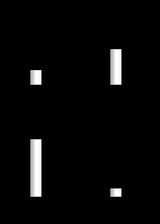
- RectangularProgressBar (Progress bar changing rectangular shape texture mask)
- RotationNeedleGauge (The gauge rotating the texture of “needle”)
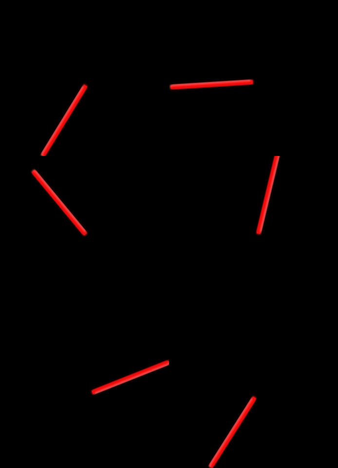
Each parts extends the PIXI.Container parts, and can be treated like PIXI.Container. To view the source code of meter primitives, refer WebSocketGaugeClientNeo/src/lib/Graphics.
Setup options
Each meter primitive classes have “Option” class to describe the setting.
Before construct the parts instance (by new statement), it is better to describe the meter setting like this..
// Create "Option" object and input the settings.
const waterTempProgressBarOptions = new CircularProgressBarOptions();
waterTempProgressBarOptions.Texture = PIXI.Texture.fromFrame("AnalogSpeedMeter_Bar");
waterTempProgressBarOptions.Max = 60;
waterTempProgressBarOptions.Min = 140;
waterTempProgressBarOptions.Radius = 162;
waterTempProgressBarOptions.InnerRadius = 120;
waterTempProgressBarOptions.OffsetAngle = 165;
waterTempProgressBarOptions.FullAngle = 120;
waterTempProgressBarOptions.Center.set(162,162);

// Create meter primitive(CircularProgressBar) object (by setting the option class as the argument of the constructor)
const waterTempProgressBar = new CircularProgressBar(waterTempProgressBarOptions);
After creating the primitive objects, the content of the “Option” objects can be accessed as Options property.
Thus, it is also possible to create primitive class with blank constructor argument, and input settings via Option property.
//Create RectangularProgressBar with blank constructor argument.
const tachoProgressBar = new RectangularProgressBar();

//Input the settings via Options property.
tachoProgressBar.Options.Texture = PIXI.Texture.fromFrame("DigiTacho_Bar");
tachoProgressBar.Options.Min = 0;
tachoProgressBar.Options.Max = 9000;
tachoProgressBar.Options.Vertical = false;
tachoProgressBar.Options.InvertDirection = false;
tachoProgressBar.Options.GagueFullOnValueMin = false;
tachoProgressBar.Options.PixelStep = 8;
tachoProgressBar.Options.MaskHeight = 246;
tachoProgressBar.Options.MaskWidth = 577;
Common properties (member of super class Gauge1D and Gauge1DOptions)
All of meter primitives have some common properties and methods.
(Actually, all of the meter primitive extend the base class of Gauge1D).
Class definition code
See WebSocketGaugeClientNeo/src/lib/Graphics/private/GagueBase.ts.
Properties
Value(:number)- The value of gauge.
- To update the view of gauge, (currently) the method of
update()orupdateForce()needs to be called after updating theValue. Please do not forget.
Max(:number)Min(:number)- Define the maximum and minimum of the gauges. It is possible to set the
Valueout of the range of Min to Max. In that case, gauge view stuck to Min or Max.
- Define the maximum and minimum of the gauges. It is possible to set the
GagueFullOnValueMin(:boolean)- This flag is set to false by default.
- If this flag set to true, gauge filling(rotation or moving) direction is inverted. (Therefore, gauge is full when he
Valueequal toMin).
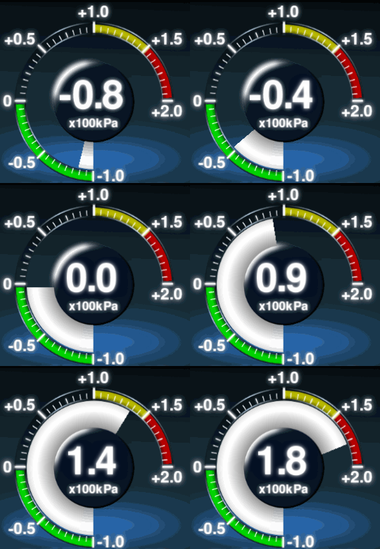
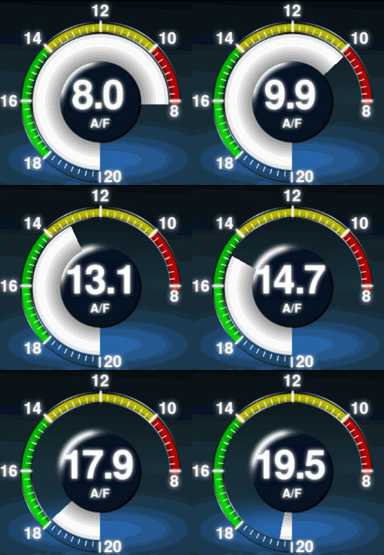
(Left : GagueFullOnValueMin = false. Right : GagueFullOnValueMin = true.)
Methods
update()- Update the gauge viewing.
- If the
Valueproperty is not changed from the previous call ofupdate(), this function is exited with do nothing.
updateForce()- Similar to
update(), but this method update the gauge viewing even if theValueproperty is not change from the previous call. - If the gauge
Valueis not updated (fixed) after creation (such as red zone indicator), use this instead ofupdate().- (This ‘value update check’ feature aims to eliminate javascript calls to improve the performance. However, this might not be so effective. And might be eliminated in future version.)
- Similar to
CircularProgressBar
-
CircularProgressBardefines the pie or doughnut shaped progress bar like gauge.
-
The
CircularProgressBarclass create the “doughnut” or “pie” shaped mask, and clips theTexturewith using this mask.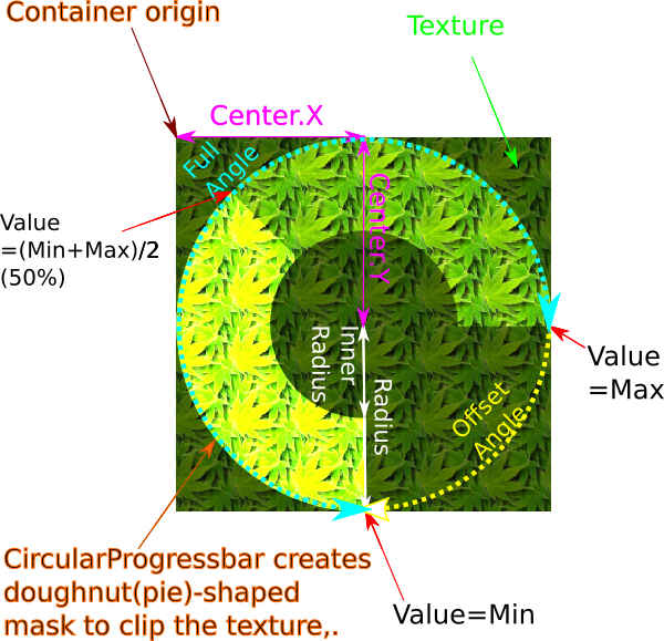
Class definition code
See WebSocketGaugeClientNeo/src/lib/Graphics/private/CircularProgressBar.ts
Example code
// Create Option class
const waterTempProgressBarOptions = new CircularProgressBarOptions();
// Assing Texture
waterTempProgressBarOptions.Texture = PIXI.Texture.fromFrame("AnalogSpeedMeter_Bar");
// Set the gauge range from 60(degC) to 140(degC)
waterTempProgressBarOptions.Max = 60;
waterTempProgressBarOptions.Min = 140;
// Set radius and inner radius of doughnut shaped mask.
waterTempProgressBarOptions.Radius = 162;
waterTempProgressBarOptions.InnerRadius = 120;
// Set "Offset" and "Full" angle (see the figure above).
waterTempProgressBarOptions.OffsetAngle = 165;
waterTempProgressBarOptions.FullAngle = 120;
// Set the center position of doughnut shaped mask.
waterTempProgressBarOptions.Center.set(162,162);

const waterTempProgressBar = new CircularProgressBar(waterTempProgressBarOptions);
Properties
Following properties are available on CircularProgressBarOptios class.
Radius(:number)InnerRadius(:number)- Radius and inner radius (in pixel) of “doughnut” shaped mask.
- If the
InnerRadiusset to 0, the mask become “pie” shaped mask.
OffsetAngle(:number)- Angle offset (in degree) of the gauge. Angle offset means the angle where
Valueequal toMin.
- Angle offset (in degree) of the gauge. Angle offset means the angle where
FullAngle(:number)- Angle displacement(swing?) from the
OffsetAngle, when theValueequal toMax.
- Angle displacement(swing?) from the
AntiClockwise(:boolean)- The direction of the filling of CircularProgressBar. Default is false.
- If this flag set to true, the progress bar is filled in anticlockwise direction.
AngleStep(:number)- The filling step of progress bar (in degree). For smooth animation this value should be set to small value (0.1 deg at default).
- However, changing this to specified angle should be useful to make “LED type” gauge (see below).
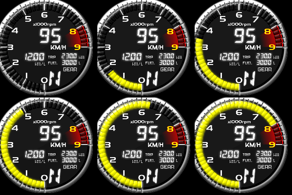

(Left :
AngleStep= 0.1deg(default), Right:AngleStep= 6deg)
RectangularProgressBar
-
RectangularProgressBardefines the rectangle progress bar like gauge.
-
The
RectangularProgressBarclass create the rectangle mask, and clips theTexturewith using this mask.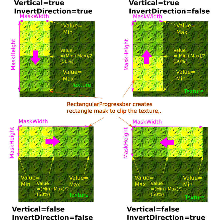
Class definition code
See WebSocketGaugeClientNeo/src/lib/Graphics/private/RectangularProgressBar.ts
Example code
//Create tacho(engine rev) progress bar
const tachoProgressBar = new RectangularProgressBar();

// Assign texture.
tachoProgressBar.Options.Texture = PIXI.Texture.fromFrame("DigiTachoBar");

// Set Max and Min (0rpm to 9000rpm)
tachoProgressBar.Options.Min = 0;
tachoProgressBar.Options.Max = 9000;

// This gauge sweeps horizontal and left to right (see above figure)
tachoProgressBar.Options.Vertical = false;
tachoProgressBar.Options.InvertDirection = false;
tachoProgressBar.Options.GagueFullOnValueMin = false;

// Set mask height and width
tachoProgressBar.Options.MaskHeight = 246;
tachoProgressBar.Options.MaskWidth = 577;
Properties
MaskHeight(:number)MaskWidth(:number)- Set the mask height and width.
Vertical(:boolean) (default : false)- Set vertical sweep (true) or horizontal sweep (false).
- When this flag is false (i.e. horizontal sweep),
MaskWidthwill be the mask width whereValue=Max. - When thus flag is true (i.e. vertical sweep),
MaskHeightwll be the mask height whereValue=Max.
InvertDirection(:boolean) (default : false)- This flag invert the sweep direction.
- On
Vertical= false- Sweep left -> right when
InvertDirection= false. - Sweep right -> left when
InvertDirection= true.
- Sweep left -> right when
- On
Vertical= true * Sweep down -> up whenInvertDirection= false. * Sweep up -> down whenInvertDirection= true.
PixelStep(:number)- Limit the step of sweep by given pixels. (as well as the
AngleStepproperty of theCircularProgressBarclass).

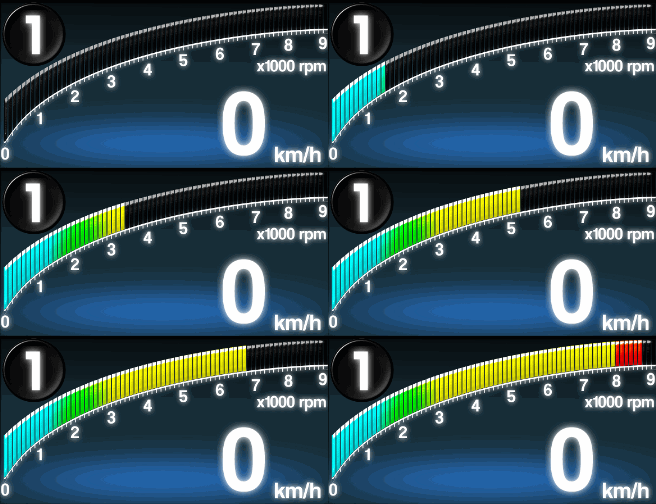
(Left :
PixelStep= 1pixel(default), Right:PixelStep= 24pixel)- Limit the step of sweep by given pixels. (as well as the
RotationNeedleGauge
-
RotationNeedleGaugedefines the meter gauge with rotation needle indicator.
-
The
RotationNeedleGaugeclass rotate itself(its container, rotation pivot should be set as PIXI.Container.pivot) corresponding itsValue.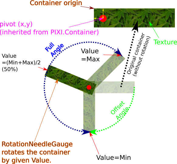
Class definition code
See WebSocketGaugeClientNeo/src/lib/Graphics/private/RotationNeedleGauge.ts.
Example code
// Create option class.
const tachoNeedleGaugeOptions = new RotationNeedleGaugeOptions();
// Assign texture
tachoNeedleGaugeOptions.Texture = PIXI.Texture.fromFrame("AnalogTachoMeter_Needle");
// Set Max and Min to 0(rpm) and 9000(rpm), respectevely.
tachoNeedleGaugeOptions.Max = 0;
tachoNeedleGaugeOptions.Min = 9000;
// Offset angle (rotation angle when Value = Min) set to 90deg.
tachoNeedleGaugeOptions.OffsetAngle = 90;
// Full angle to 270deg.
tachoNeedleGaugeOptions.FullAngle = 270;

// Create gauge instance.
this.tachoNeedleGauge = new RotationNeedleGauge(tachoNeedleGaugeOptions);

// Set rotation pivot coodinate to (15, 15)
this.tachoNeedleGauge.pivot.set(15,15);
// Place needle gauge to (300, 300)
this.tachoNeedleGauge.position.set(300,300);
Properties
Properties is similar to those of CircularProgressBar.
OffsetAngle(:number)- Angle offset (in degree) of the gauge. Angle offset means the rotation angle where
Valueequal toMin.
- Angle offset (in degree) of the gauge. Angle offset means the rotation angle where
FullAngle(:number)- Angle displacement from the
OffsetAngle, when theValue=Max.
- Angle displacement from the
AntiClockwise(:boolean)- The direction of the rotation of needle. Default is false.
- If this flag set to true, the needle is rotated in anticlockwise direction.
AngleStep(:number)- The rotation step of needle (in degree).